Responsibilities:
Research, Wire framing, UI Design, Prototyping, User testing
Tools used:
Adobe Illustrator
Figma, FigJam
Duration:
100 hours
According to a Pew Research Center fact sheet, half of US adults get news from social media.
Social media platform usage for news and information
Youtube
23%
30%
16%
TikTok
14%
X (Twitter)
12%
8%
❌ The Problem
With the ease of sharing content and the proliferation of user-generated material, distinguishing between fact and fiction has become increasingly challenging for users.
✅ The Goal
Equip users with a reliable tool to distinguish between accurate and misleading information. This solution would make researching a topic simple, promote critical thinking and empower the online community to spread factual information.
✋ Target Audience
Individuals who rely on social media as a primary source of news and information looking for a solution to avoid misinformation with confidence and clarity.
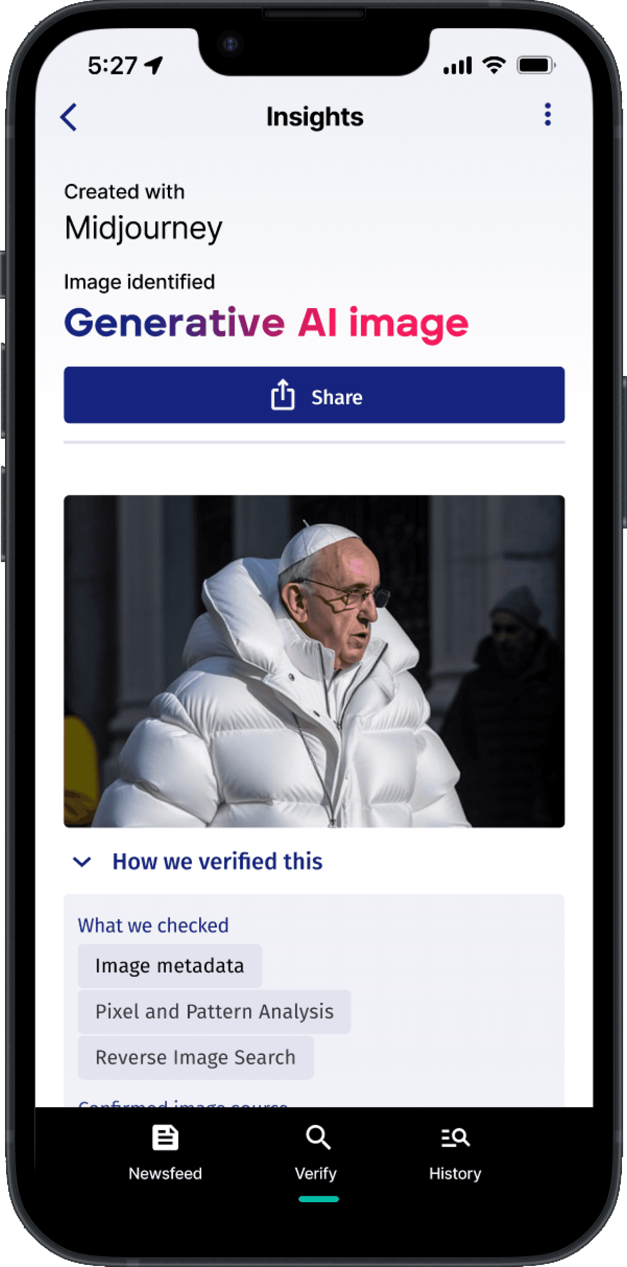
This is not a real photo. It is an image created with Midjourney. Did you notice?

INSIGHTS DISCOVERED
How might we simplify news verification for users encountering misinformation on social media?
Design insight #1
Research finding #1
5/5 users find it frustrating when they come across misinformation or fake news on social media platforms
How might we enable users to quickly research unfamiliar topics when they lack time to do so?
Design insight #2
Research finding #2
4/5 users does not have the time to research topics they are uninformed on
How might we help users navigate the overwhelming volume of news sources and information available online?
Design insight #3
Research finding #3
5/5 users feel overwhelmed by the sheer volume of news sources and information available
CURRENT SOLUTIONS

Strength
Nonpartisan
Free
Broad organization of credible staff
Weakness
Limited scope of topics
Not realtime. Only articles
Limited answers

Strength
Meticulous fact-checking process.
Diverse coverage across topics.
Trusted reputation for accuracy.
Weakness
Possible bias perception.
Not realtime. Only articles
Limited answers

Strength
Meticulous fact-checking process.
Diverse coverage across topics.
Trusted reputation for accuracy.
Weakness
Possible bias perception.
Not realtime. Only articles
Limited answers
Now that I understood specifically what the users' needs and pain points were, I began to do a competitive analysis to see how some of these problems were being addressed and if there were gaps for innovation and improvement.
This research brought to light 3 important insights into the challenges users face when attempting to verify the credibility of information encountered on social media and the internet.
What worked: All users loved the verifi feature and format of the summarized article.
The product allowed the user to quickly input a URL from a social media post and instantly have an idea if it was true or not.
All users loved format of the summarized articles. They offered a short answer section to let the user quickly learn about the answer they were given, a more in depth response (dig deeper section), and the sources to research further into the topic if they wanted to.
The original goal of the initial screen was to allow the users to see all of the sections of the screen upon reading the claim and credibility score. After testing users responded that they wanted to have access to seeing two things without having to interact with the app.
What didn’t work: Users wanted to instantly be able to read the summarized article and see the sources.
Early testing of my mid fidelity screens provided great feedback on the features and layouts.
16237F
DADCEB
484A56
F7175D
3EE7D2
00A492
5B5D6B
Color Palette
COLOR PALETTE & BRANDING
Using the feedback from testing I moved on to design the color palette, logo and high fidelity screens. For the color palette I wanted to use a modern color palette that could be used for the rating system and evoke a feeling of trust from the user.
Gradients

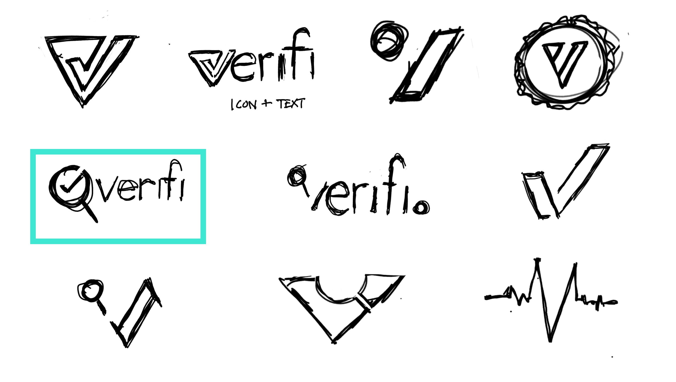
Logo
High Fidelity Wire Frames
Not bad, we can do better.

Google Meeting
Remote Usability test
5 usability testers
5 usability testers


Success Metrics
Completion rate of task
Satisfaction score (1-5)
Goals
Gather success metrics
Measure task efficiency
To further refine the high fidelity screens I created a prototype and walked users through all the task a user would do when using this app.
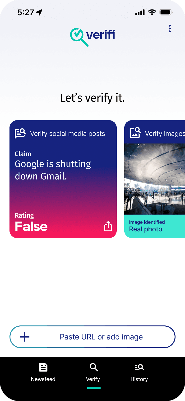
Simplify the field and update the copy of the field.
Ask question or paste URL
Paste URL or add image
Solution
Separate the field into two separate elements to better define the options available for the user
Add clearer and more explicit copy to help direct the user
Add an icon to help inform the purpose of the field
User problem
Before
After
Some users confused when using the input field to add an image or URL.

Solution
Adding more white space allows each block of text easier to digest for the user.
Adding colors to the credibility score make the page easier to scan
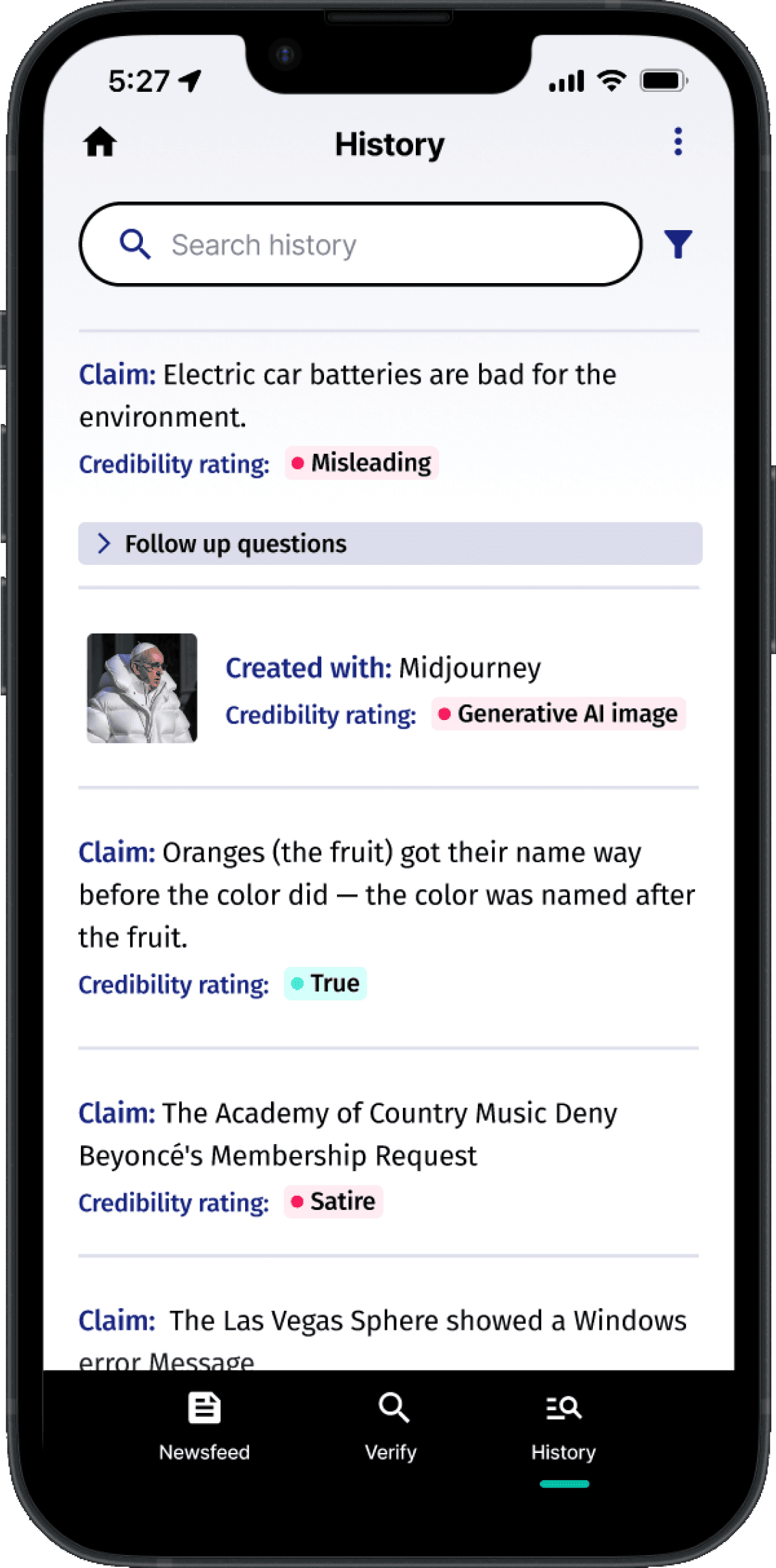
Adding a history field and filter will help the users find previous entries more easily.
Create more space between history entries and make the screen easier to scan
User problem
Users commented that the history page was text heavy and not as easy to read.
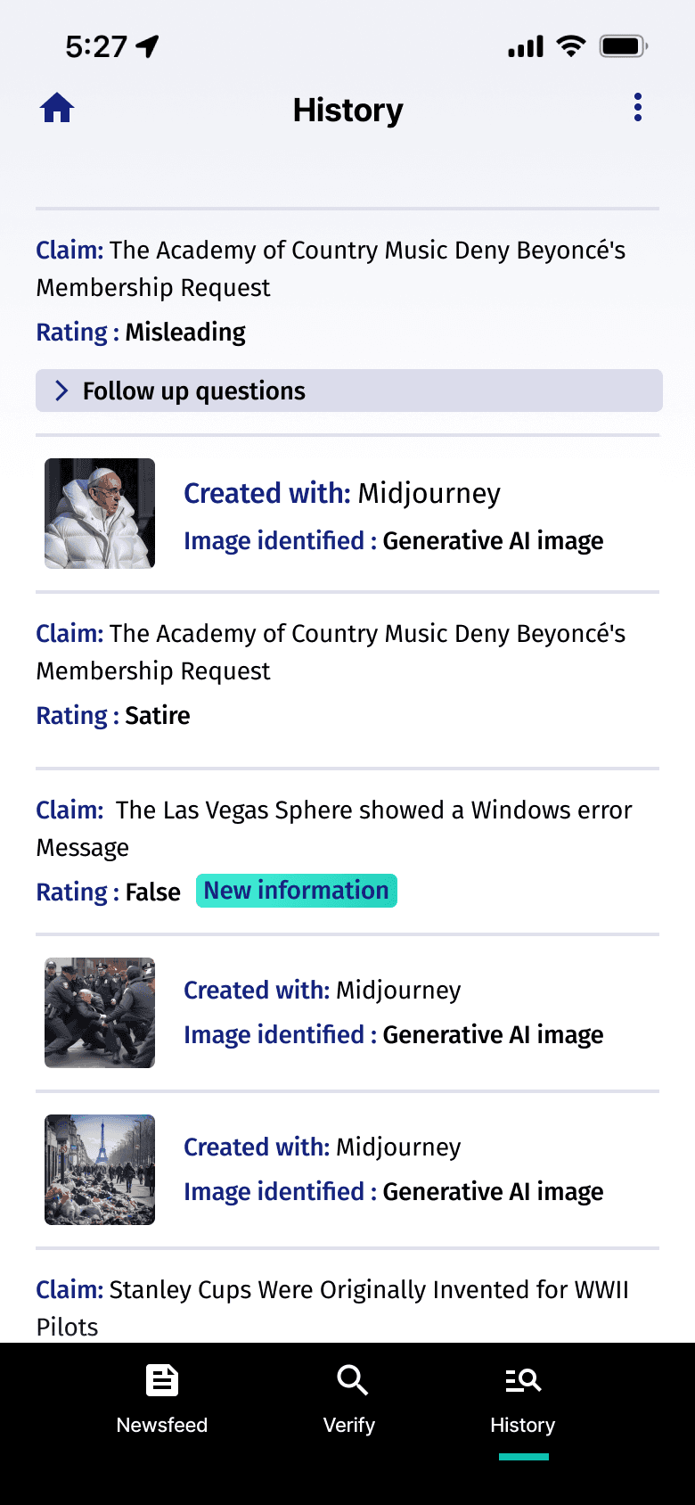
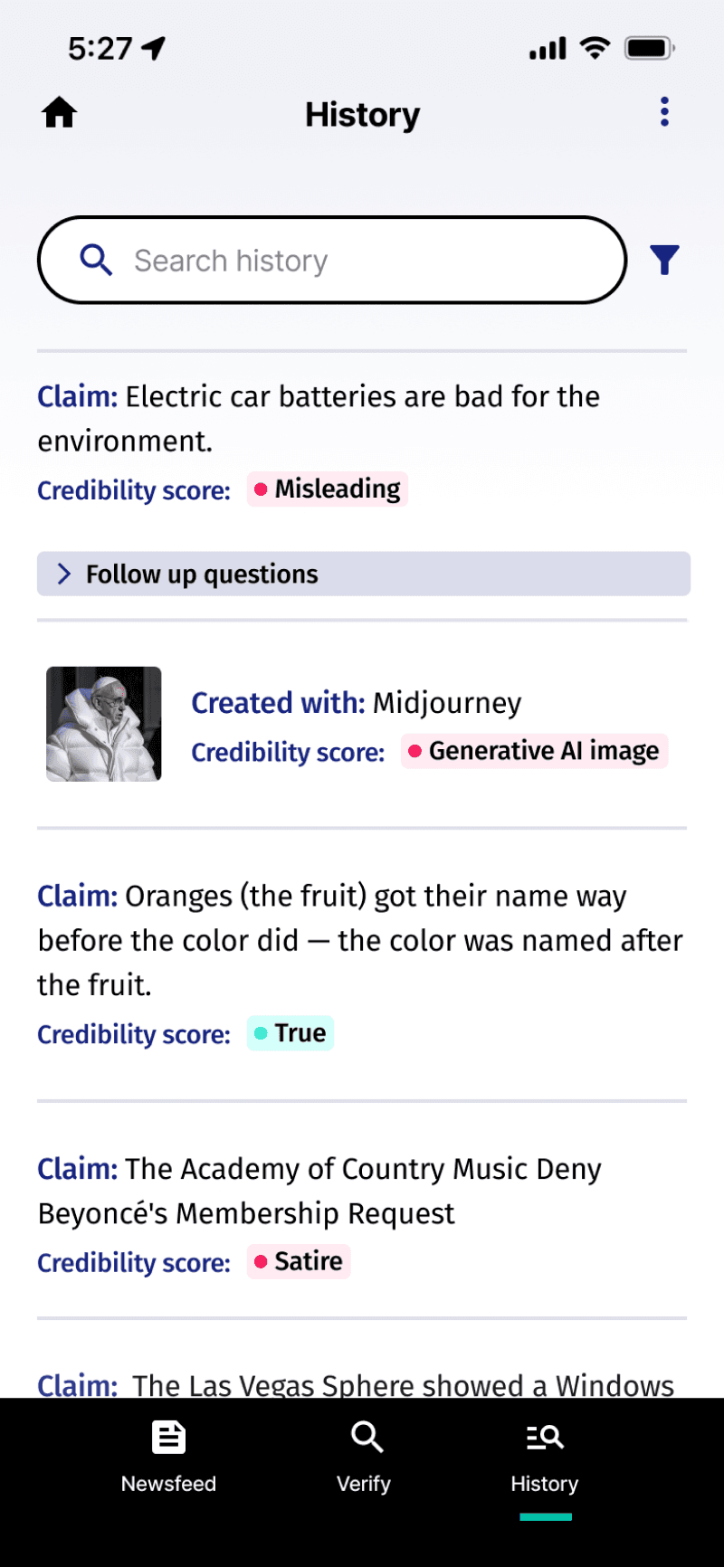
Solution
After weighing the priority of the outlet logos to the trust score it made more sense to remove the logos to add the trust scores
Prioritize the trust score over the outlet logo
User problem
Users wanted to also know the trust scores of the additional sources in the newsfeed

Testing the high fidelity wire frame with the new iterations was very successful.
5/5
Users could complete the task to enter a social media post URL or an image from their device.
Compared to 3/5 before
5/5
Users found the new iteration of the history page easier to read and scan over the previous version.
Compared to 4/5 before
5/5
Users found the trust score more useful than the source’s logo on the newsfeed screen
Compared to 5/5 before/5 before
LEARNINGS & REFLECTIONS
Sometimes more is more
Splitting apart the input field into separate components for adding an image or typing a question or URL made it much easier for users to quickly understand how the UI would behave.
User-Driven Iteration
Going back to elements that have been tested allows us to keep making improvements based on what users tell us, which is important for making sure our product is easy and enjoyable to use.
Clarity is king
Having clear and concise instructions is crucial for ensuring smooth user flows and a positive user experience, as it guides users effectively through the product's features and functionalities.
Verifi: Misinformation Detector
Verifi is a mobile application that allows users to identify misinformation
on social media and images created by generative AI.
Users who rely on social media platforms for news and information
Users who encounter a variety of content shared by friends and influencers on social media
Users who seek quick access to information on trending topics
Who I interviewed
To gain insight into the behaviors, specific goals, and pain points of users I conducted user interviews with 5 participants.
UNDERSTANDING THE USER
Opportunities for improvement
Users have to wait until these platform post a written article confirming information or disputing misinformation.
1
Because articles are written by a staff of writers the platform’s resources are limited. The breadth of the topic they cover is also limited.
2
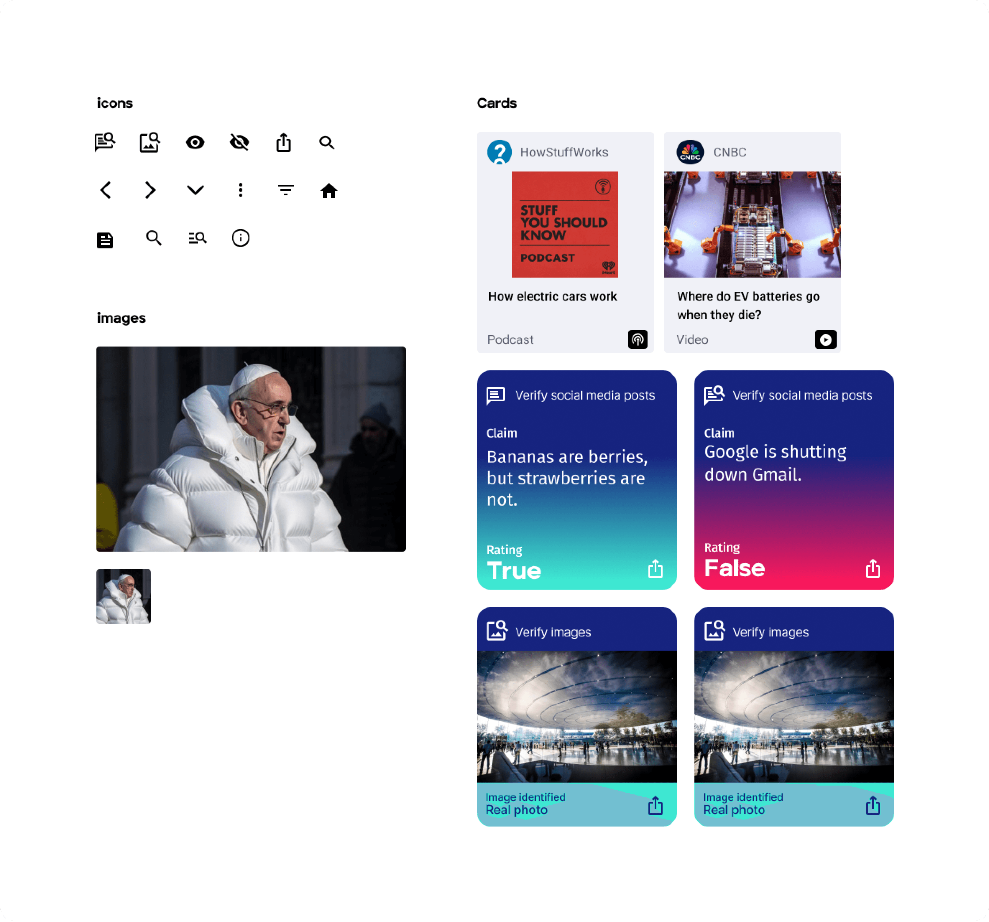

Verifi UI Kit
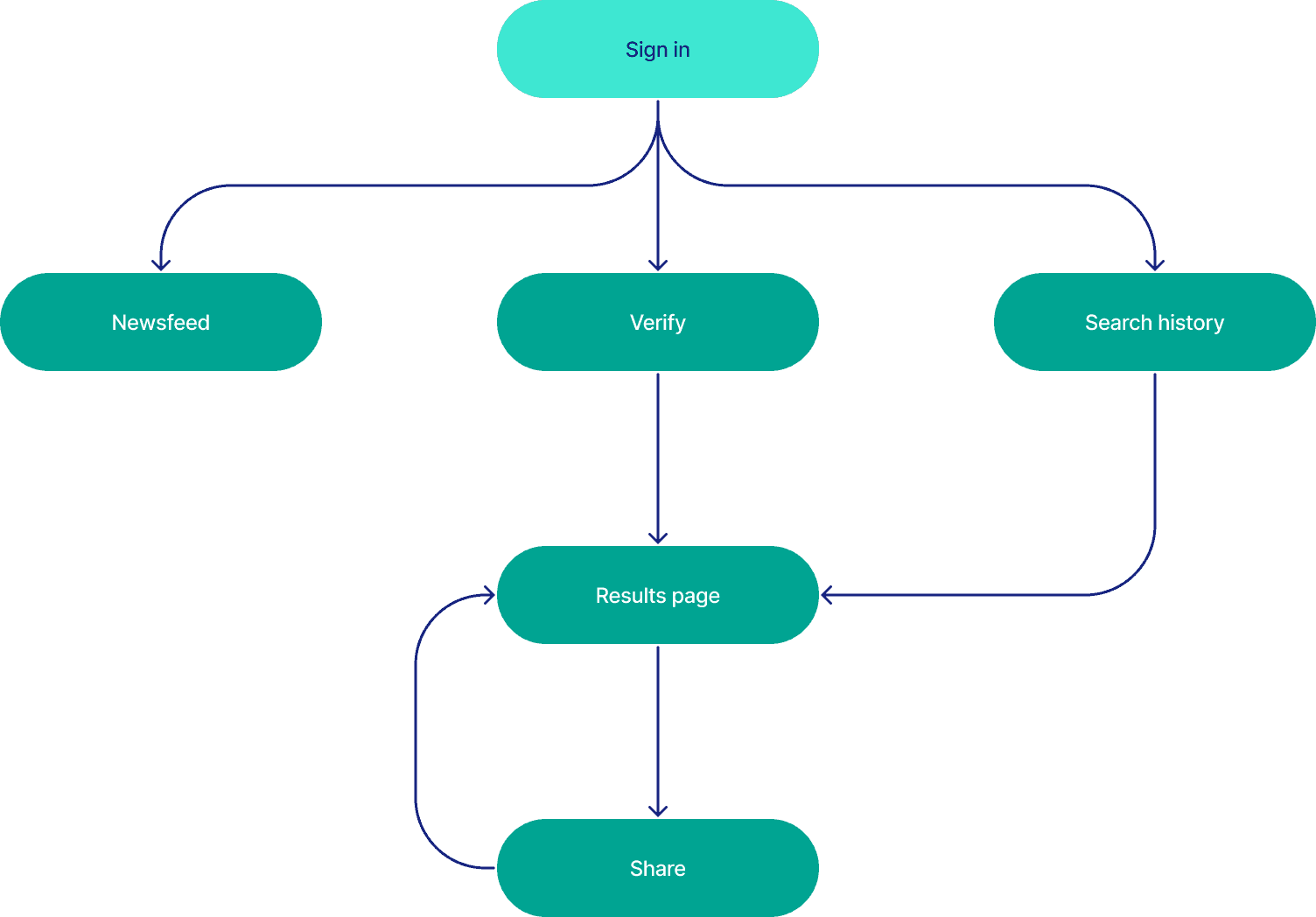
Verifi Sitemap
With the key features and opportunities of my solution identified I created a sitemap. Creating a sitemap gives me a bird's-eye view of the product that I can use to identify potential navigation issues, optimize user flow, and ensure a cohesive structure for the overall user experience
Home page
Response
Newsfeed
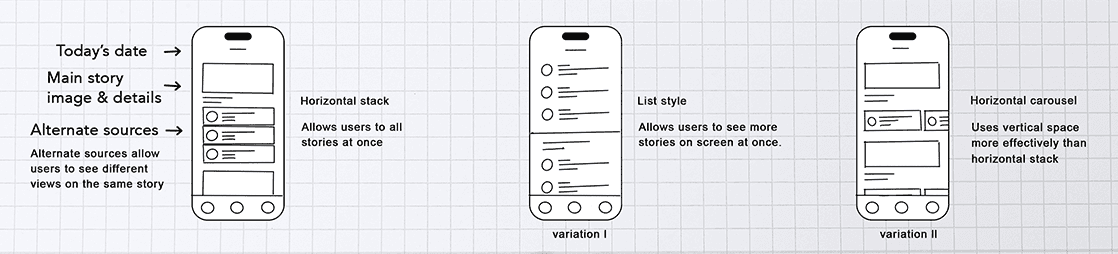
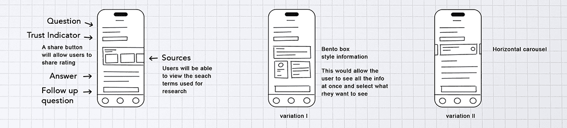
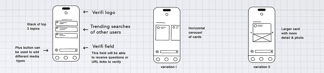
Low fidelity sketches and ideas
I used sketches to explore ideas, quickly iterate different designs and think through how I want the features to work.
Mid fidelity Prototype
I created mid-fi wireframes to build out interactions and flows to test with users.
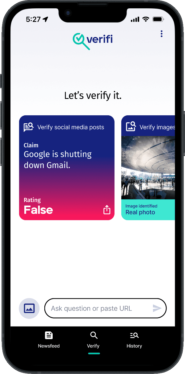
Final solution
Quickly Verify news, images and information
HOME SCREEN
During user interviews users felt unequipped to identify false news. 4/5 users did not have time or want to research and verify the news and information they encountered on social media and online.
Verifi help quickly give users a trust rating for articles, images and information. It also empowers the user to easily continue their research with follow up questions and summarized articles.
Uncomplicating Fact-Finding
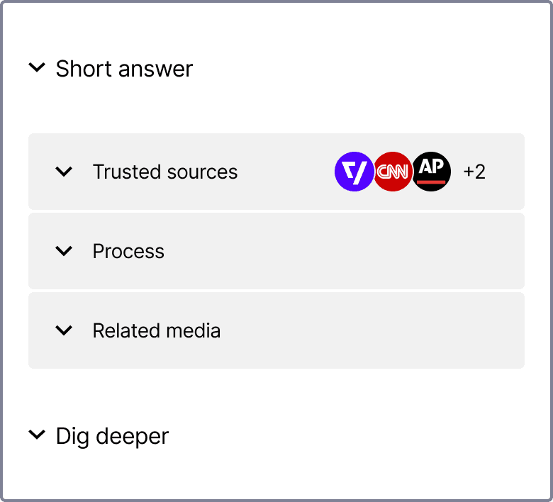
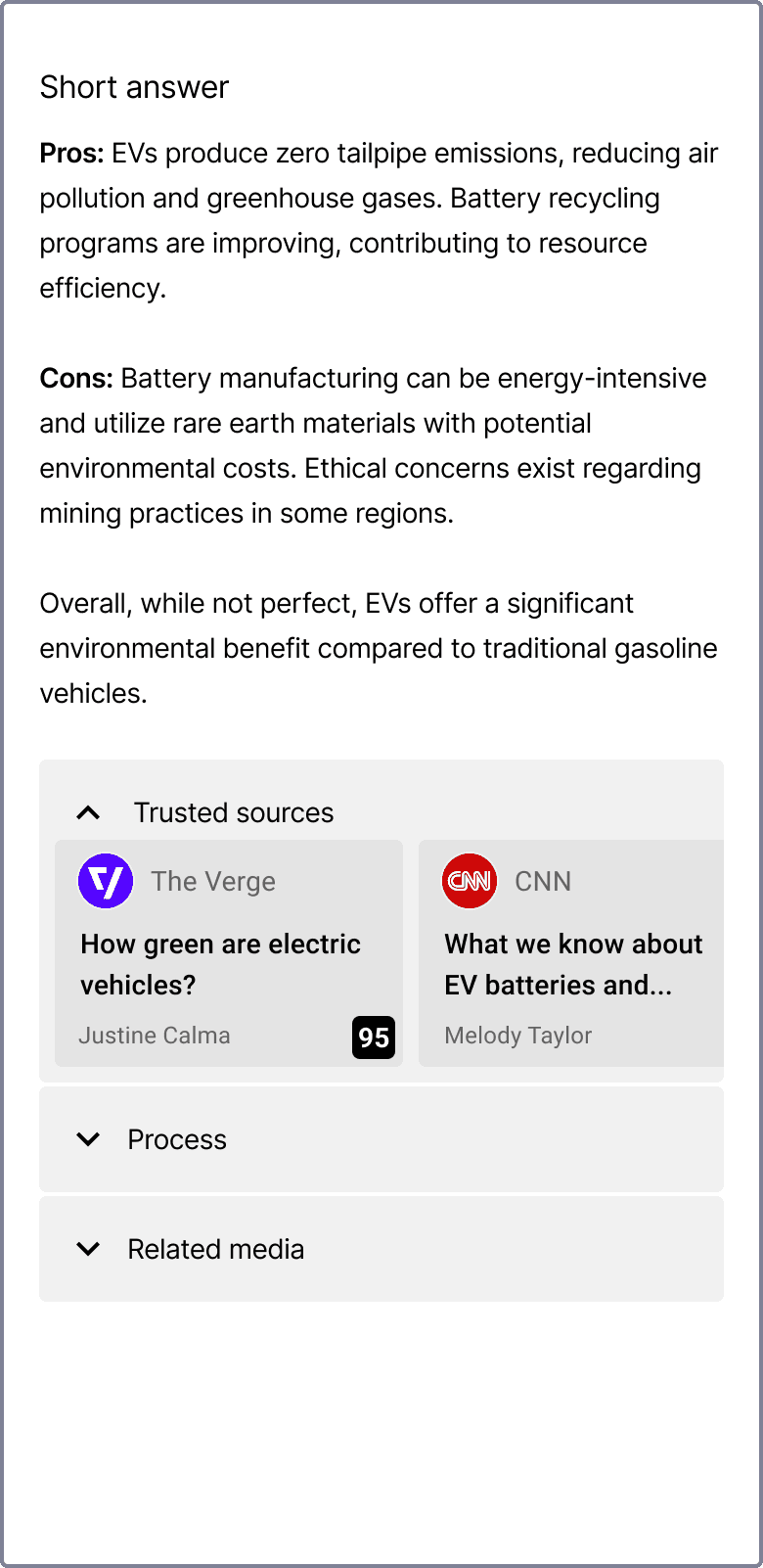
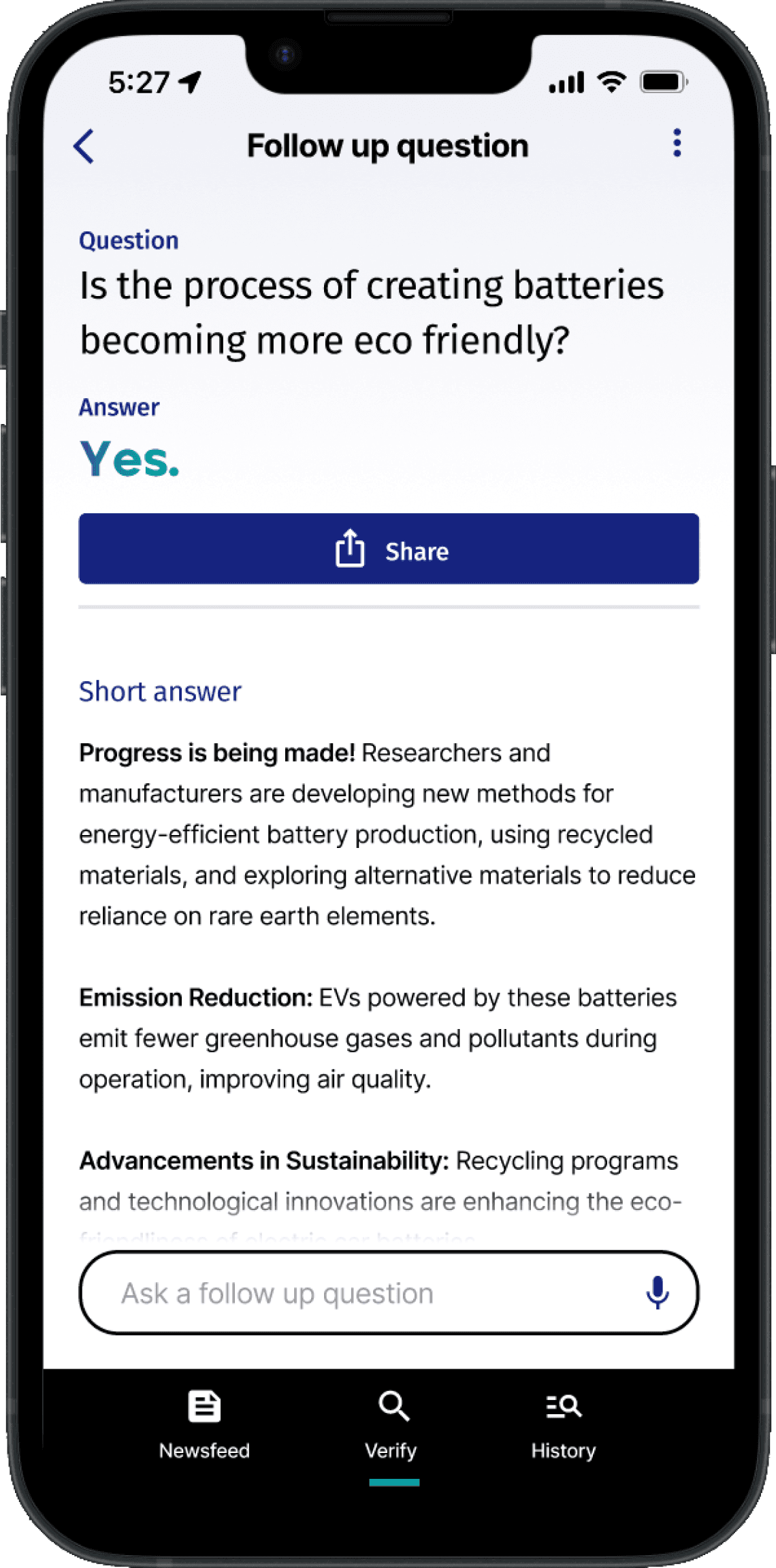
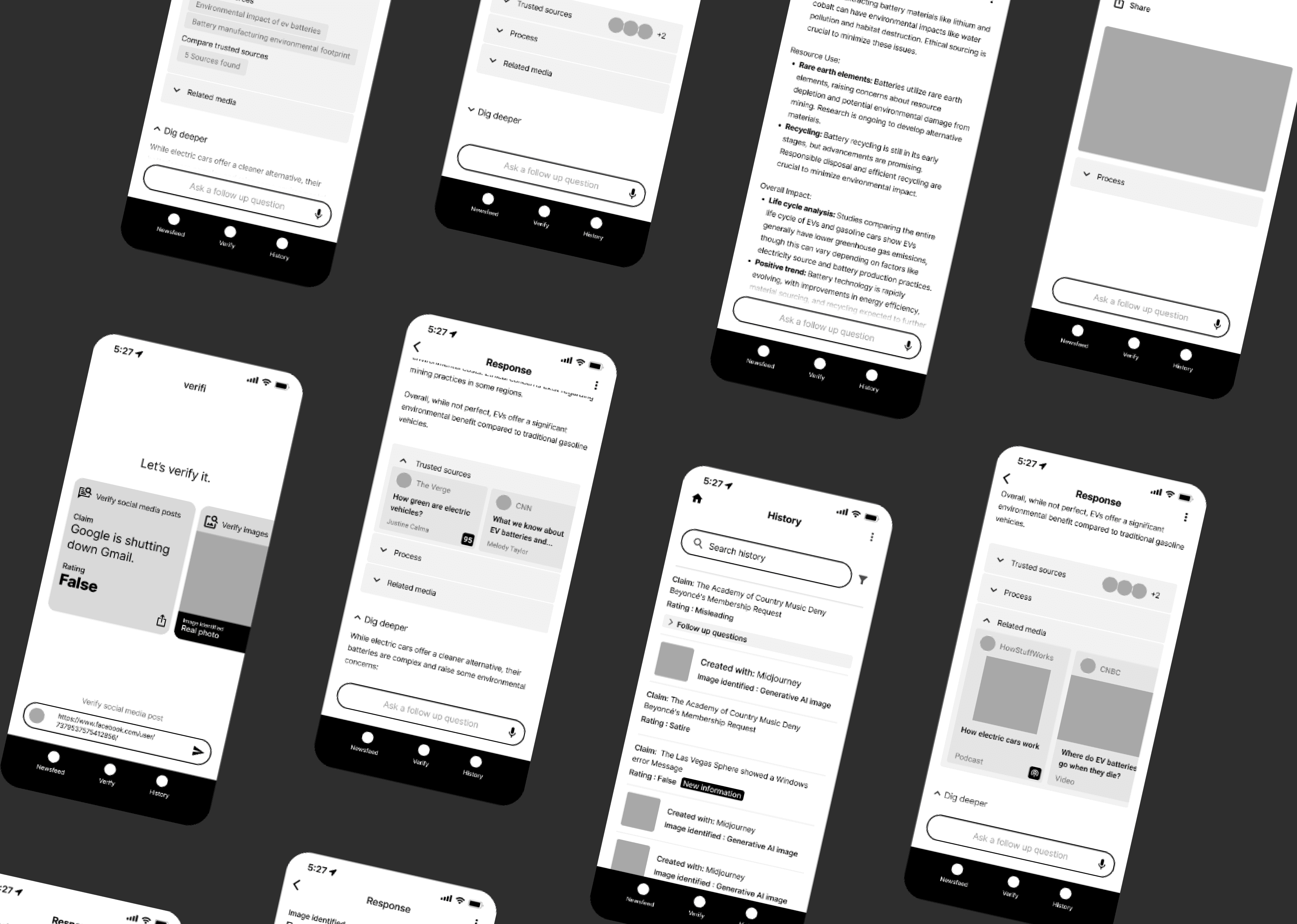
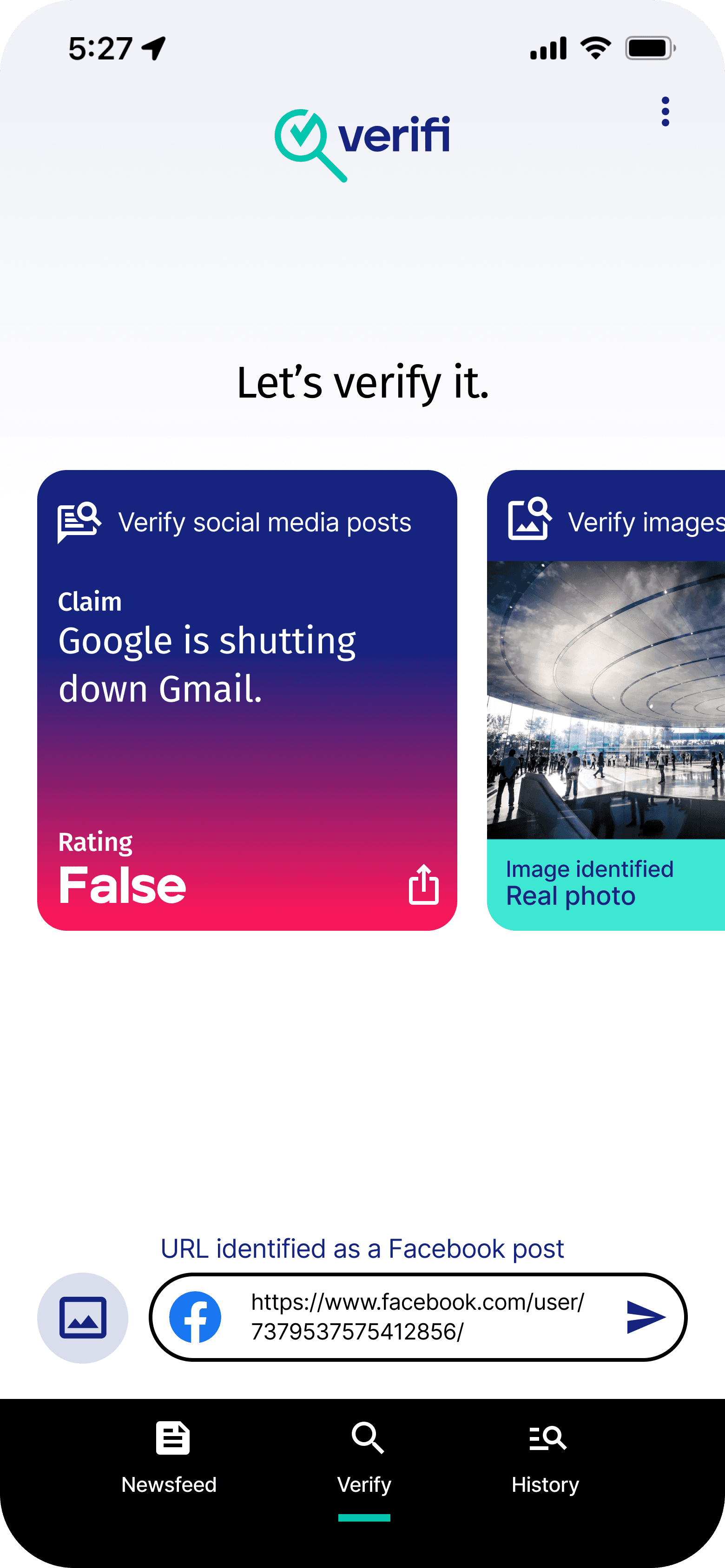
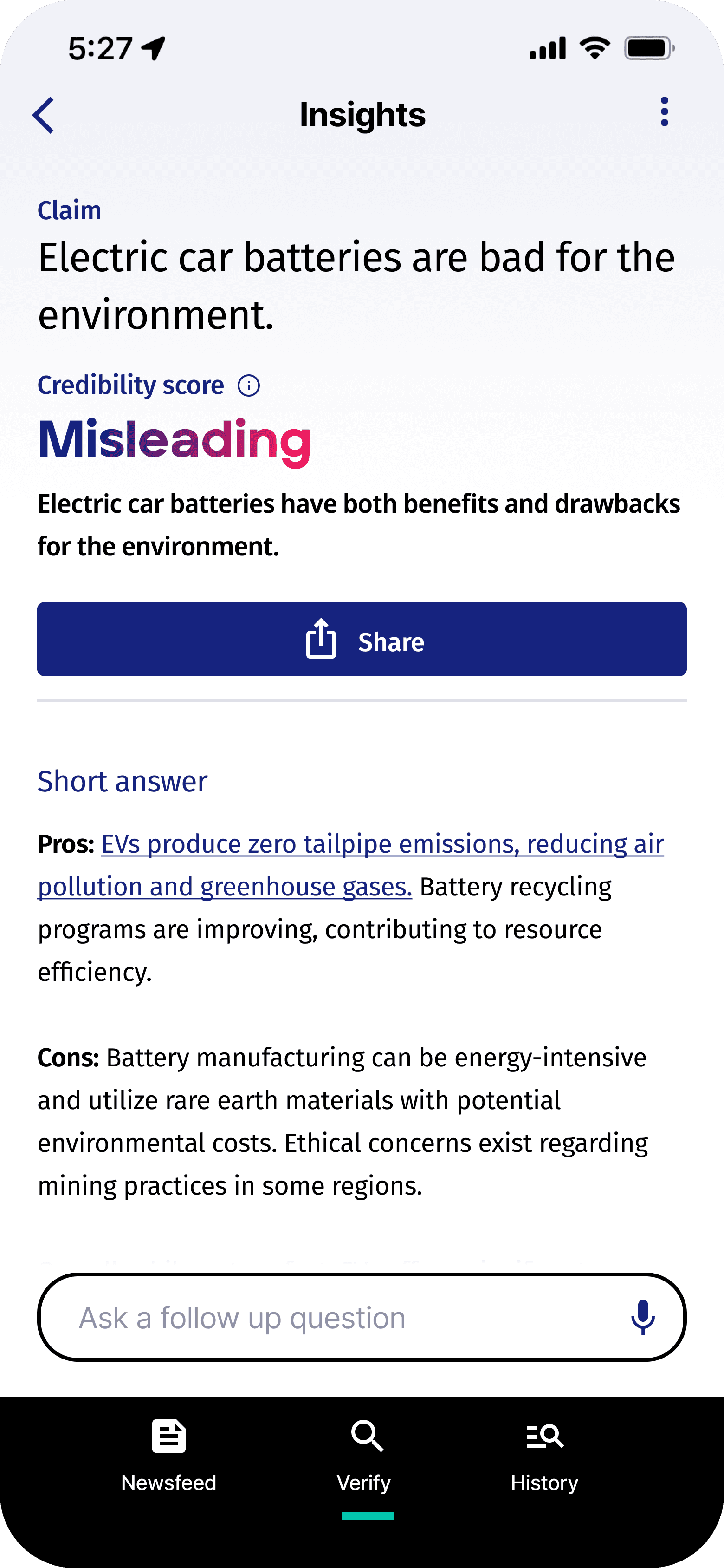
RESPONSE SCREEN
The response page offers users a credibility score for the content they're checking. It includes a quick overview for efficient understanding and a "Dig Deeper" section for users interested in more details. Additionally, it transparently displays the research conducted to generate the score, showcasing articles and sources used for independent verification and informed decision-making. Users can easily share verified findings and flag false information, promoting greater awareness and helping others identify and avoid misinformation.
Cutting through the clutter
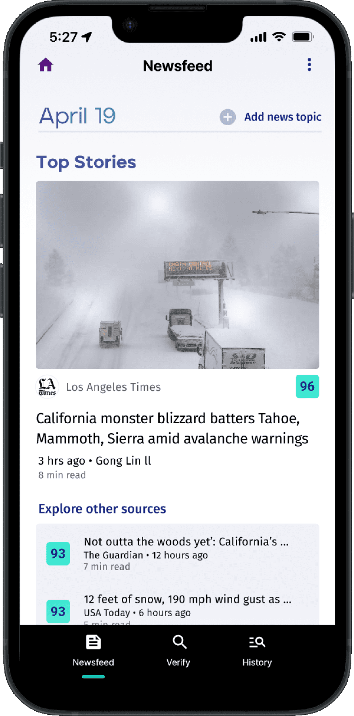
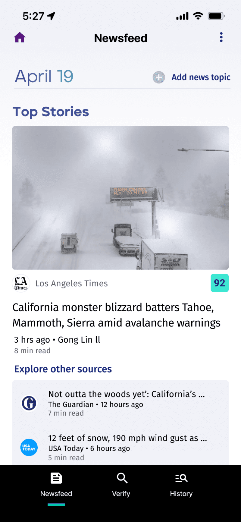
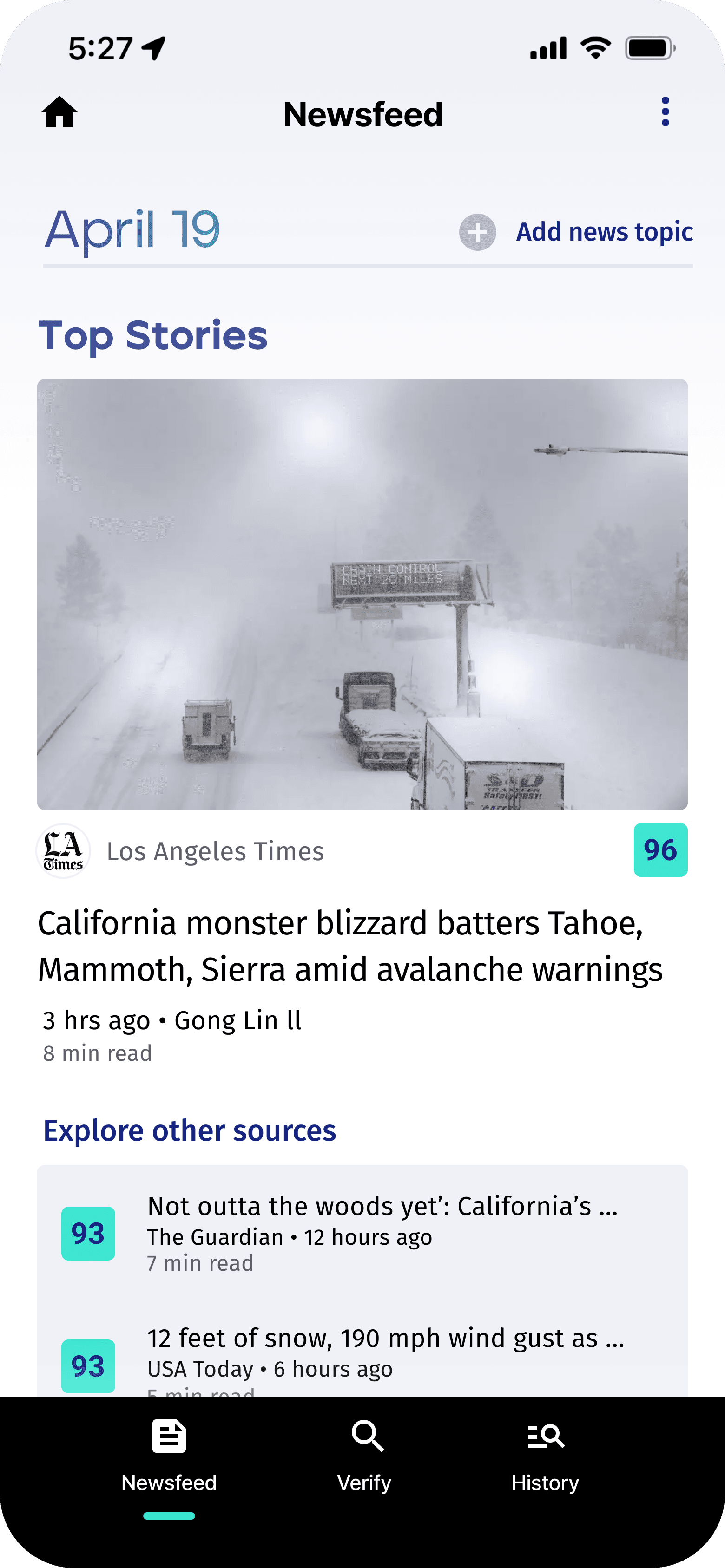
NEWSFEED
Users often struggle to discern misinformation in their daily news consumption, with many feeling overwhelmed by the volume and potential biases. Verifi addresses this challenge by providing users with instant credibility ratings for sources directly within their personal newsfeed. This empowers users to make informed decisions about the information they encounter, fostering a more trustworthy and transparent online environment.
more work
Max Game Night
An new way to enjoy old favorites
Google Maps
Collaborative Planning Tools for Avid Travelers
UX Designer,
Animator,
& Illustrator.